Mas Que Nada Branding Guidelines
For this project, I created a brand identity for Mas Que Nada, a regional grocery chain concept inspired by the rich culinary traditions and diverse cultures of Mexico, Central, and South America. This was developed as part of my Type & Typography class, where i focused on building a visual aesthethic that felt vibrant, authentic, and community-centered.
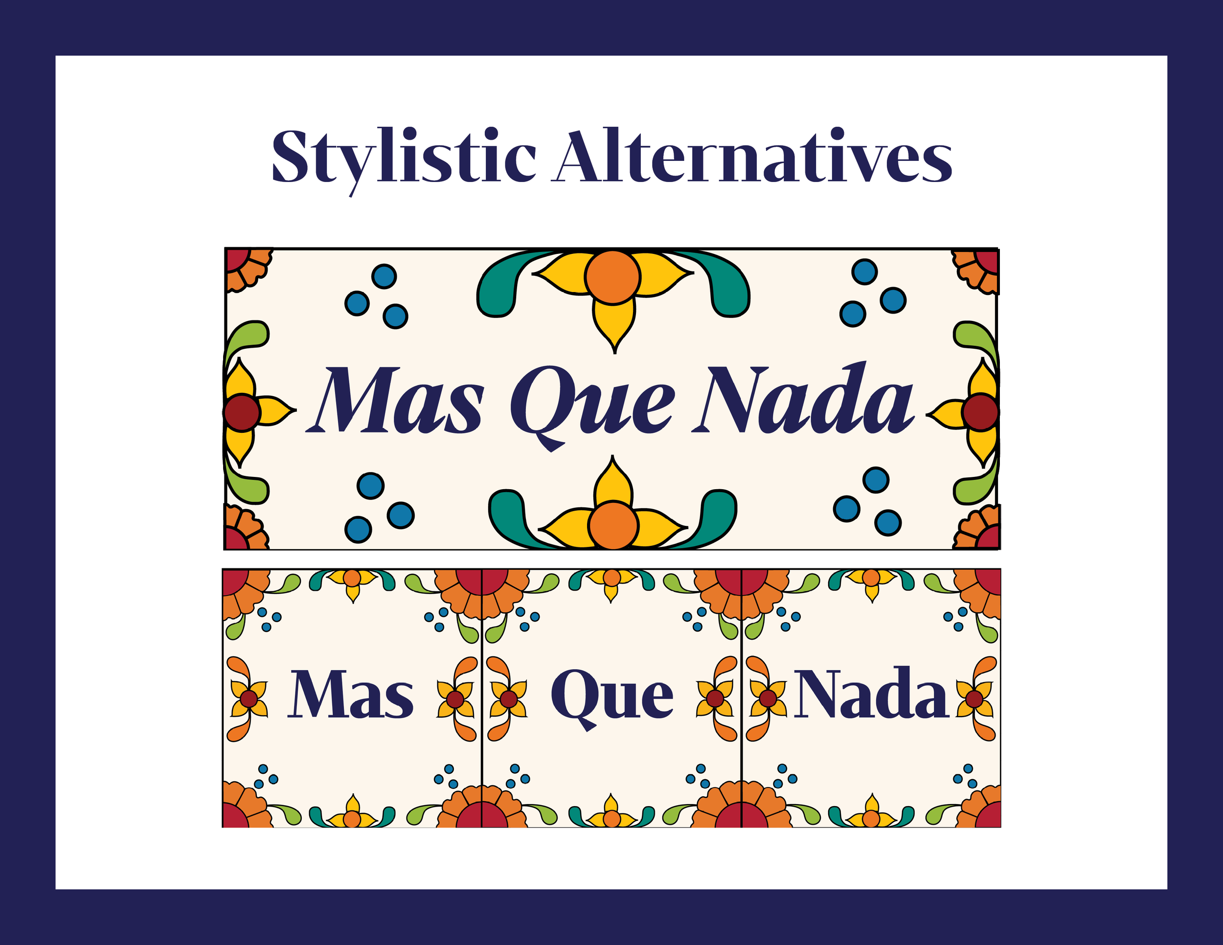
I designed the logo with traditional Talavera tile art in mind, using bold colors and floral motifs to represent the brand’s cultural roots. I chose Mixta Didone for the header type to bring in a sense of elegance and heritage, while Poppins was used for the body text to maintain readability and a modern touch. Together, these typefaces helped strike a balance between tradition and contemporary design.
I also developed a color palette that reflects the warmth and energy of Latin American culture. Throughout the process, I created mockups to explore how the brand would look across different touchpoints—from signage and packaging to store visuals.
This project gave me the opportunity to explore storytelling through typography and branding. It challenged me to think about how design can celebrate culture while staying functional and visually cohesive.
Software: Indesign, Illustrator, & Photoshop